Why Study Abstract Composition?
- Melinda Tidwell

- Sep 14, 2021
- 2 min read
Shortly after I began making abstract book collages on a steady basis (back in 2011), I wanted to know how to make them “better”. Or I wanted to know what “better” even was. Or even what “passable” was. I did not really understand what the aim of my arrangement was. What was successful vs. unsuccessful?
I found it very difficult to find answers as to how this all worked. But questions gnaw at you, and so over the intervening years, I have gradually pieced this together. I was greatly helped by art teachers and chapter 2 of this book

They write about Visual Ordering and Principles of Organization. What a revelation to read those words!
I don’t know how many of you have looked at Principles of Design lists online. They vary widely (some have 15 principles!) and it remains a complete mystery how to apply them to the goal I had, To Make My Work Better. So this book offers this diagram:
This is at least one view of how it all fits together. I understand everything clearly until I get to this pink box and once again I don’t know how to use this list to improve my art.
In our upcoming workshop, Abstract Composition – The Deep Dive, we create an alternate list. My list is short, but each principle has its own particular magic to impart to your work.
Harmony vs. Variety is that delicate balance between a composition that is coherent and of a whole, but still has surprise, wildness, and the irrational. The cover image on this book, Eiso by Paul Manes, is a superb example of pushing variety hard, while still maintaining harmony. Look at all the different ways he paints a bowl! Creativity, inventiveness, this is something I love to see in art.
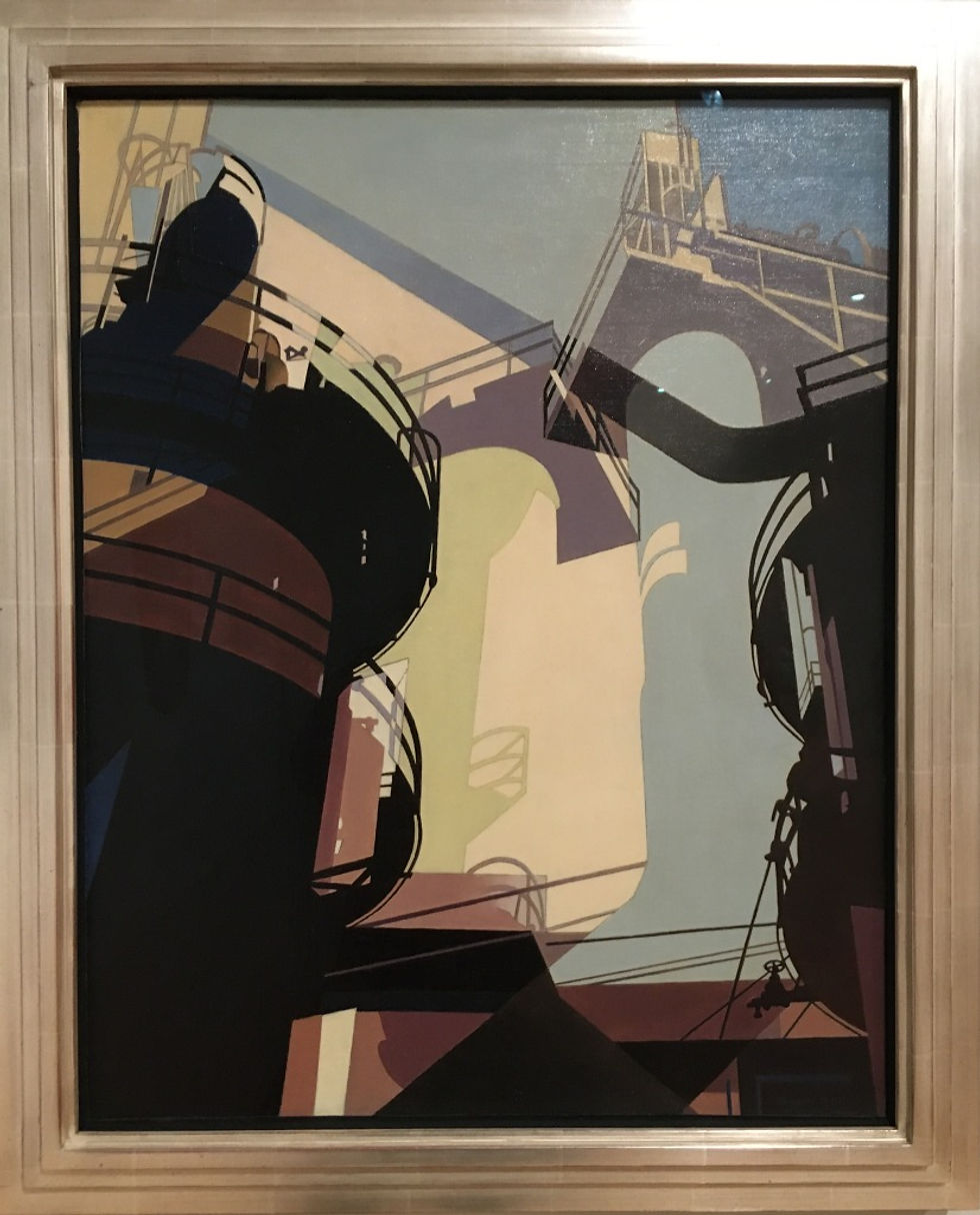
Value is easier to get right at the beginning and it establishes a strong foundation to keep building on. Notice how important the darks, and especially black, are in giving this painting a logic, and a structure, our eye can follow. This is a principle I did not know about and my early work feels weak and undefined because of it.
Visual Weight is a term I prefer to dominance, as more descriptive of the same idea. It refers to how much an element draws the eye. We want different weights, but they should harmonize, no one being too loud or too quiet. Look at the tension the red bowl creates, so bold in this composition, and yet it scuttles your eye to the other dark bowls, the black outlines, as you attempt to integrate it. For some people (like me) it may be too bold and they would change the color. But I admire it’s daring, all the same.
The shaping that goes on according to these simple ideas is so interesting, and empowering. So many people joining Yum City tell me they lack confidence in their work. This knowledge, and practice, can really help. You come to recognize the reins you have in your hands to steer your creations.
If you feel like this course could be for you, jump on our Notification List to get additional course content and signup info!
Happy Creating,
Melinda


Comments